The Hidden Meanings of Colors
- Mar 10, 2022
- 2 min read
Anyone that has ever decided upon colors for his or her store knows that these choices are not taken lightly. The subliminal effect of color on people is too important. The effects could mean the difference between a return visit or even a sale. A quick refresher on the hidden meaning of colors and thoughtful planning of your color choices for walls and for accent colors can help generate noticeable dividends.
Blues Blue instills a sense of calm in people. It brings to mind the ocean and sky, and these instill a sense of peace. Try using darker shades on the bottom portion of a wall which lightens as it goes up to the ceiling and then ending in white is one way to accomplish a soothing effect. What is calmer than the blue of the sky? Blue also implies ice-cold freshness. We often advise it in seafood or even produce departments.

Greens
Various shades of green can stimulate a sense of freshness. Also peace and health. Greens used in produce departments are quietly effective. Also in flower departments or health food sections of a store. Darker greens feel affluent, stylish. They can instill a sense of quality. Jewelry stores, fine clothing departments can benefit from these darker shades as well, especially when combined with lighter shades of green.


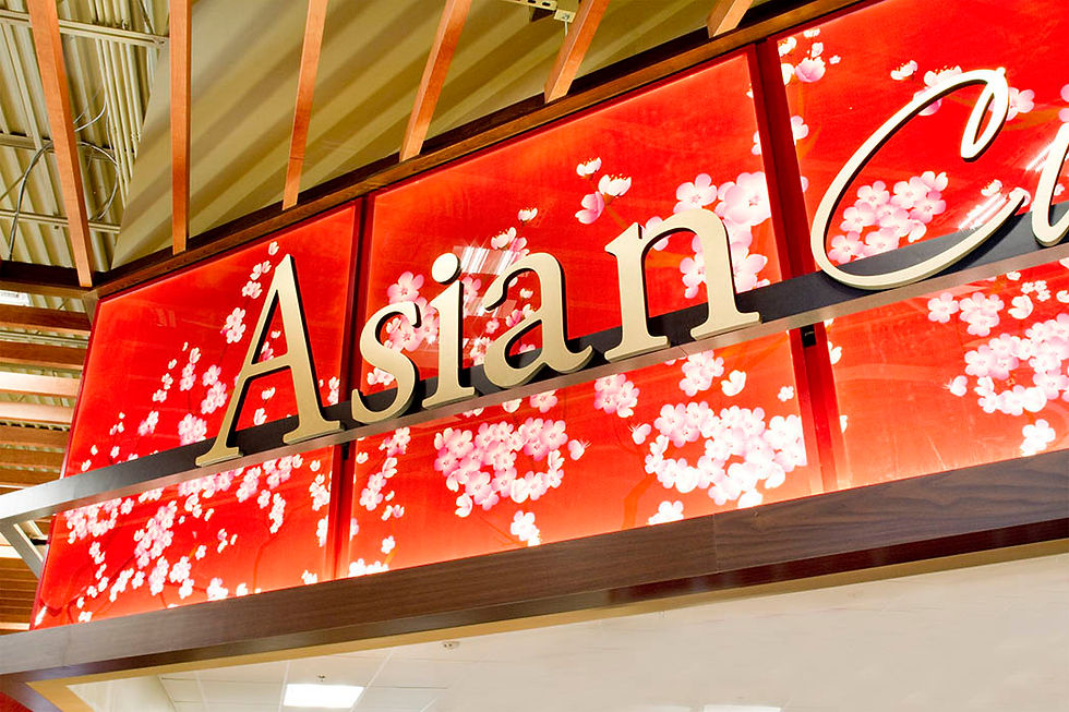
Reds Red says passion. Used too much it can stimulate anxiety or even aggressiveness. Sparingly, or as an accent color it calls attention to a particular area of your store. It can also stimulate appetite as evidenced by our use of it in fresh meat departments.

Yellows
These are happy colors. They inspire cheerfulness and hope. Departments with products for children often use shades of yellow. Used to tint white or orange walls that seem creamy, the effect is one of warmth and comfort.

Orange
Exhilarating! It also causes feelings of fun and playfulness. Light shades can conjure up feelings of opulence. Like red, shades of orange could also be used to stimulate appetite. Orange is a popular color in restaurants.

Purples and Pinks Pinks and purples have a similar effect on people as reds and blues, but used as accent colors they can be perceived as aristocratic and a sign of wealth. Other signals: mystery, spirituality, royalty, and creativity.
Shades of pink and purple can convey femininity, energy, fun, romance, and sexiness.

Browns
Used sparingly browns can denote stability. Various shades of brown are a good choice for flooring and background for signage.

Black
This is a dramatic color choice. It denotes elegance, up to date style. Young customers associate it with trendy items. It can be used in specific areas of a retail store for a bold look.

Grays
These tones are considered neutral and in light shades can enhance other colors.

White
The lightest shades of white imply simplicity and purity. It is the best backdrop to punch up other colors, especially bold ones resulting in impactful signage and decor.


